Your AI-made posters all look the same
The 7-line prompt, the Avoid line and the named styles that keep your poster from looking AI-made.
The prompts from the article, ready to paste into ChatGPT.
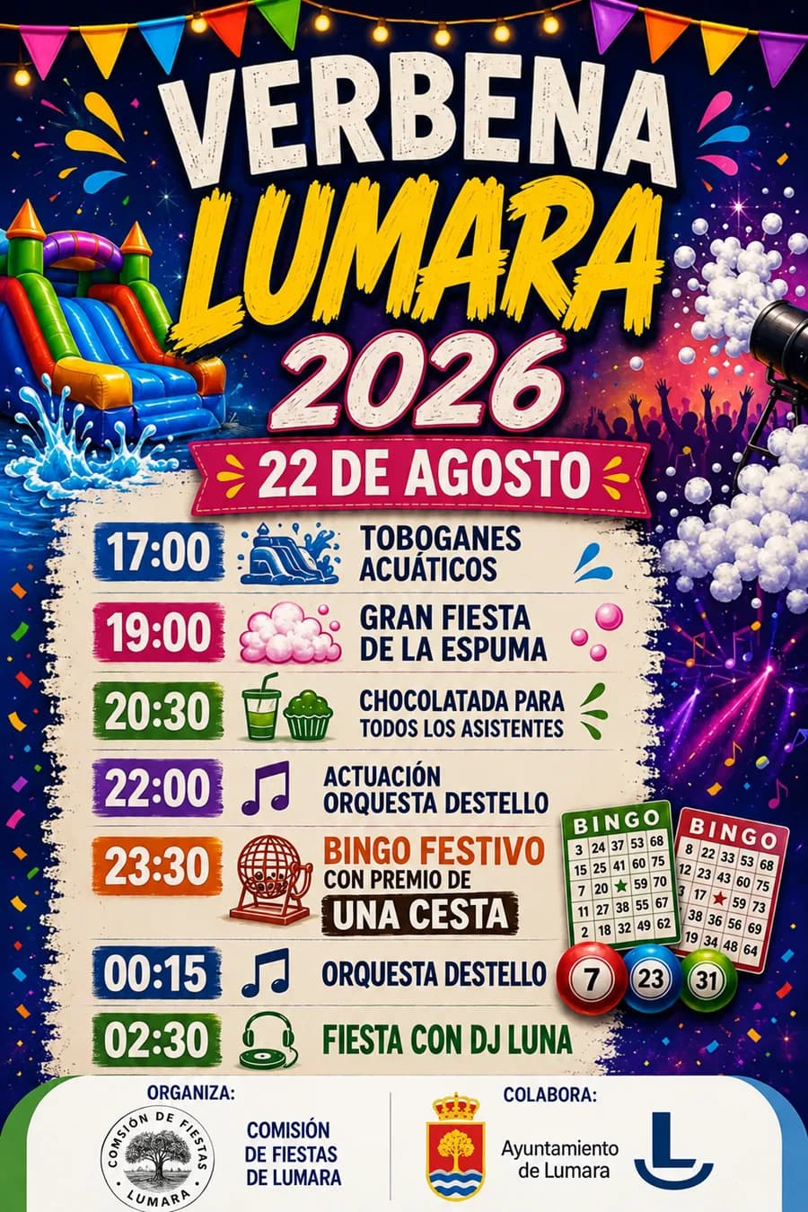
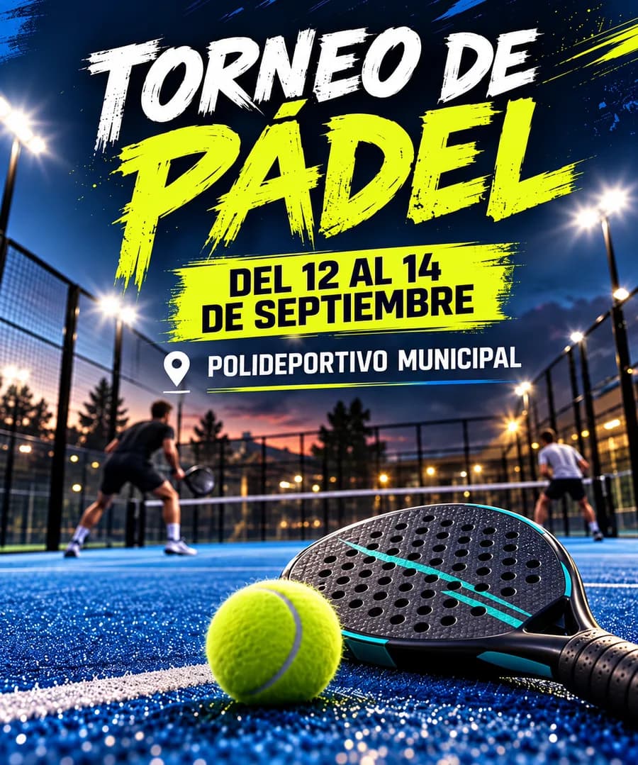
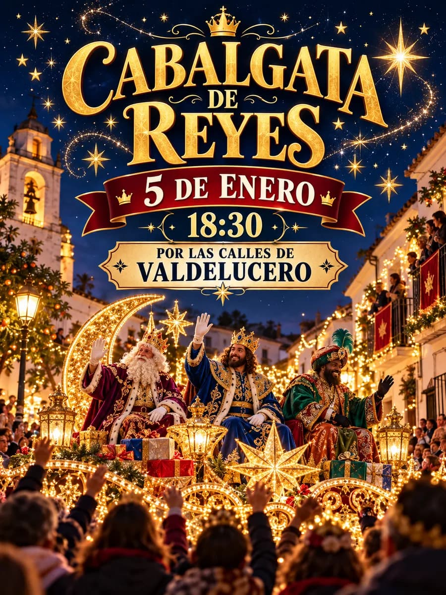
Paper lanterns, little gold stars, shiny script lettering and people laughing in a group. You have seen it a thousand times: at the Three Kings parade, at the village summer party and at the club's padel tournament.
It is not ChatGPT's fault. It is the prompt's.
Here I walk you through it step by step so you never make a generic poster again.
Why all your posters look AI-made
There are three reasons, and all three can be fixed.
- If you don't specify, it goes for the average. Ask it for a summer party poster and you get the most typical thing from every summer party in the world: lanterns, bunting, a stage and people dancing.
- "Make it pretty" is not an instruction. It sounds fine, but it says nothing. You have to name what you want: a style by name, a typeface and some colours.
- You don't tell it what you don't want. And what you don't want has a name: brush strokes behind the title, little rays around the text, sparkles, script lettering.
1. Ask ChatGPT what it did wrong
This trick is great and almost nobody does it. Ask for the poster the way you normally would. When the generic poster comes out, ask it:
"What is the typeface you used called, and what are the decorative elements around the text called?"
It will tell you with specific names: horizontal rules, radial lines, string lights… Write them down. That is your blacklist.
2. The 7-line prompt
Open a new chat, type Create a poster and paste this underneath:
Format: [vertical 4:5 / horizontal 16:9 / square]
What it is: [type of event or goal of the poster]
Theme: [date, time, place and the visual protagonist]
Style: [design, art movement or technique, by name]
Exact text: "[title]", "[date and time]", "[place]". No other text.
Typeface and palette: [typeface by name] · [3 colours by name]
Avoid: [everything that gives away AI + the clichés of this theme]
Two lines change everything:
- "No other text". Without that sentence, ChatGPT makes up a slogan ("A magical night!") and the poster screams AI.
- "Avoid". It is your anti-AI line.
3. The Avoid line
This one goes in always, on every poster:
Avoid: brush strokes behind the text, brush underlines, rays and sparkles decorating the text, speed lines, distressed texture, dry brush strokes, stars and confetti, ornaments around the title, people laughing in a group, script lettering.
Then add the clichés of the theme that you don't want:
- Summer party: paper lanterns, bunting, string lights, moons.
- Christmas: gold stars, baubles, glittering snow, wreaths.
- Sport: neon rays, fire, smoke, stadium backgrounds.
- Technology: robots, brains, neon, blue gradients.
- Art exhibition: marble busts, gold leaf, brush strokes, calendar and clock icons.
- Gig: microphones, musical notes, a yellow spotlight on black.
- Book fair: stacked books, glasses, coffee cups, dry leaves.
- Summer: smiling sun, splashes, palm leaves.
Example: the summer party
Create a poster.
Format: vertical 4:5
What it is: poster for a summer street party
Theme: Saturday 26 July at 22:00 in the town square. Protagonist: a single paper lantern.
Style: watercolour illustration
Exact text: "Summer party", "Saturday 26 July · 22:00", "Town square". No other text.
Typeface and palette: normal-width geometric sans · midnight blue, warm yellow and white
Avoid: bunting, string lights, confetti, branches and flowers, stars and moons, brush-stroke bands behind the text, distressed texture, sparkles, speed lines, rays decorating elements, brush underlines, horizontal rules.
Same event, same ChatGPT, and the difference is huge. It looks like a person touched it.
4. Style is where the magic is
The style can be three things:
- A design: Bauhaus, Art Deco, Memphis, Swiss Style, editorial layout.
- An art movement: constructivism, surrealism, pop art, Op Art, Dada collage, 60s psychedelia.
- A technique: screen printing, risograph, linocut, pixel art, watercolour, paper cut-out.
You have all 100 styles further down, each with its line ready to paste.
Now look at these. They were also made with ChatGPT, but each one with a named style:
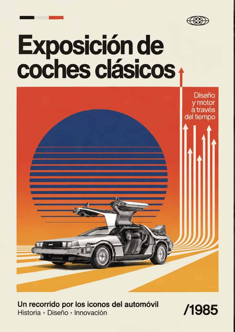
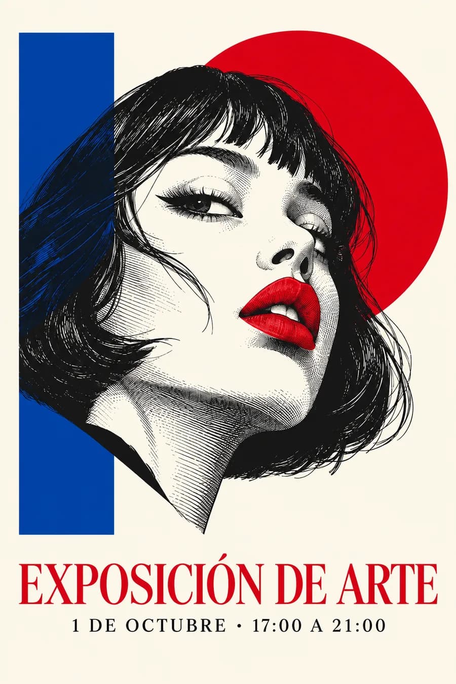
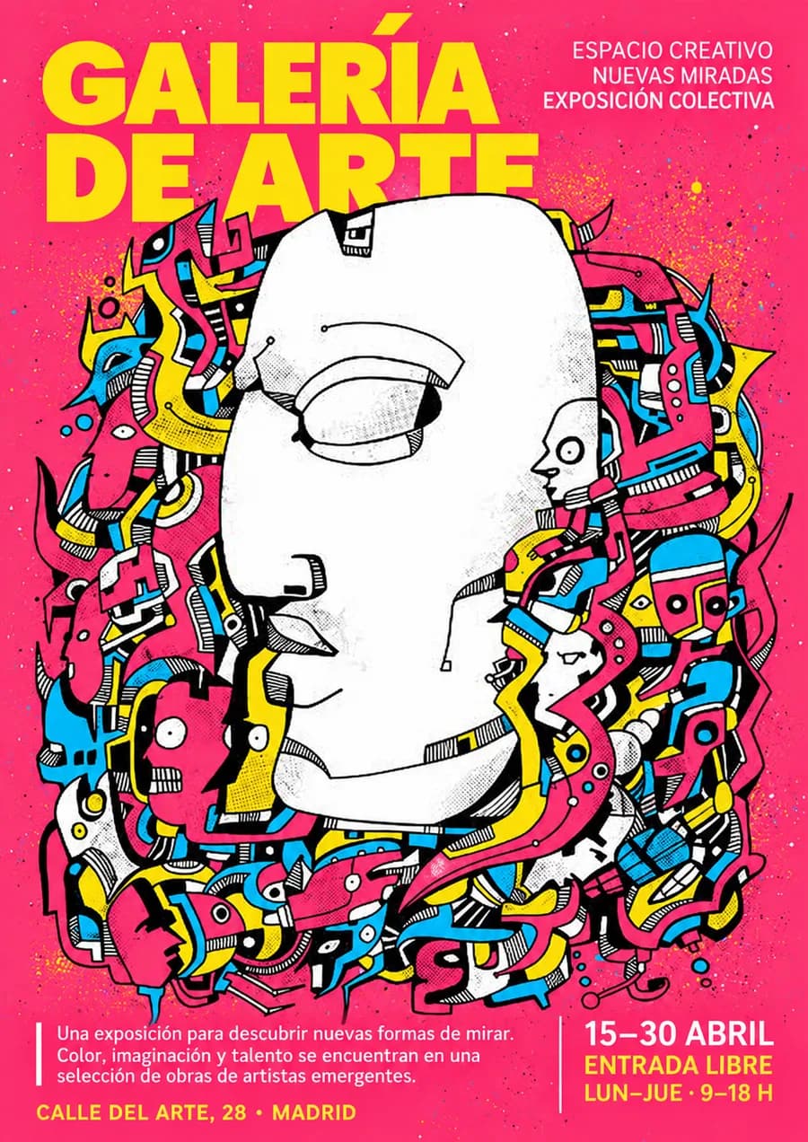
To try styles you don't need to repeat the prompt. In the same chat:
"Generate the poster in [surrealism] style. Keep all the specifications and the Avoid line."
The "keep the Avoid line" part is essential. If you leave it out, the sparkles come back.
If it still drags things over from the previous poster (colours, ornaments, a phrase you never asked for), open a new chat and paste the whole prompt, changing only the style line.
And if only one part is wrong, don't redo everything. Select that area in ChatGPT's image editor and describe only what changes. The selection isn't exact, so also tell it what it must not touch.
5. The pro trick: mix styles
One style for the layout, another for the illustration and another for the technique:
"Style: Art Deco layout, pixel art illustration, screen printing technique."
You get the symmetry of Art Deco, a bust that looks like it came out of a video game and the flat inks with the halftone dots of screen printing. Nobody who sees it will think an AI made it.
More mixes that work:
- Swiss layout + black and white photography + two-colour risograph.
- Memphis + flat illustration + paper cut-out.
- Bauhaus + Dada collage + screen printing.
- Constructivism + ukiyo-e + risograph: Soviet diagonals with a two-colour Japanese landscape.
- Swiss Style + surrealism + cyanotype: a perfect grid with a dream scene in blue and white.
- Japanese minimalism + pop art + etching: lots of empty space, a single comic element and an old engraving finish.
6. Not just posters: your products
The same prompt works for anything you sell. Upload a photo of your product and change the "What it is":
- Instagram image: "Theme: the product in the foreground, large, filling the bottom half, with a huge title behind it cut off by the product."
- Exploded view: "What it is: exploded view of the product in the photo, with each part separated and floating on its axis."
- Knolling: just write "Knolling". It lays out all the parts neatly on a flat surface, seen from above.
- Blueprint: write "Blueprint" and it draws it like a technical drawing.
- Infographic: the whole product with each part pointed out and explained.
And in the Avoid line: "dark backgrounds, gradients, detail circles, icons, slogans, invented parts". The invented parts matter, because otherwise it adds buttons your product doesn't have.
7. Carousels with your brand
If you make carousels every week, stop writing the prompt again. Turn it into a ChatGPT skill, which is a file with instructions that ChatGPT follows every time you call it.
From ChatGPT's skills section, create a new one "with the chat" and paste this:
Create a skill called "Carousel [your brand]" that makes Instagram carousels with my brand.
When I call it, ask me 3 questions: what it is about, how many slides and which angle (quick guide, mistakes, comparison, step by step or saveable prompt).
With my answers, propose the cover headline and the text of each slide, and wait for my OK before generating any image.
Generate each slide with this pattern:
Style: [your brand's, e.g. clean tech editorial, lots of white space, rounded buttons, very soft shadow]
Typeface and palette: [your typeface] · [your colours]
Avoid: robots, brains, neon, gradients.
Every slide carries "[your brand]" in the footer in [your colour].
Then, in a new chat, you call it with @, paste the information and it asks you the 3 questions. You give it the OK and it produces the slides, all with the same design, the same margins and the same format.
8. The 100 styles, ready to paste
Each style with what you will see and its Style line. Copy the line and paste it into the 7-line prompt.
The group tells you which layer of the poster it controls: design styles, the layout; art movements, the image; techniques, the finish. That is why you can mix them.
- If the style brings its own lettering (Art Nouveau, psychedelia, ukiyo-e…), write "the style's own" in Typeface and palette. Force another typeface on it and you lose it.
- If it brings its own texture (engravings, zines, risograph…), remove "distressed texture" from the Avoid line.
The names and groups come from John Hartnup's Poster Prompts catalogue.
Graphic design. They decide the layout: where the text goes, in which typeface and how everything is ordered.
- 001
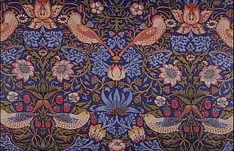
Arts and Crafts
Dense leafy ornament and worked borders, William Morris style. It smells of craft and markets.
Style: Arts and Crafts, William Morris leafy ornament, decorated borderImagen: William Morris · dominio público, Wikimedia Commons - 002
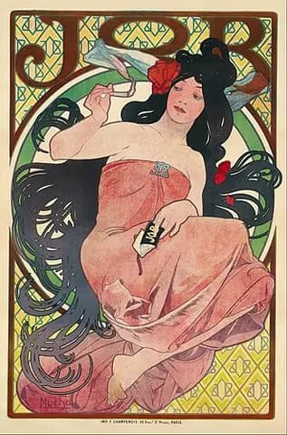
Art Nouveau
Curves, flowers and long hair inside a frame, like Mucha's posters. It brings its own lettering.
Style: Art Nouveau, organic curves and floral frame in the style of MuchaImagen: Alphonse Mucha · dominio público, Wikimedia Commons - 003
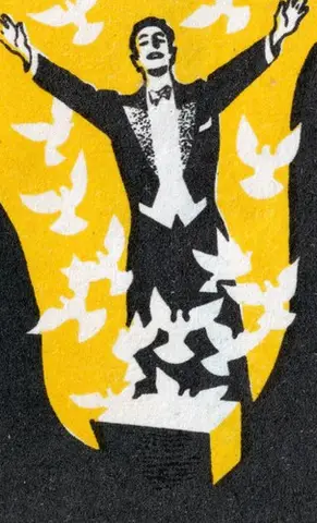
Art Deco
Stepped geometry, sunburst fans and gold on dark. 1920s luxury, for galas and dinners.
Style: Art Deco, stepped geometry and gold on a dark backgroundImagen: Anonymous matchbox label · dominio público, Wikimedia Commons - 004
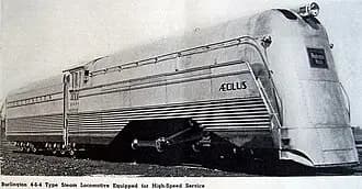
Streamline Moderne
Aerodynamic shapes and rounded corners, like a 1930s train. Optimistic and full of motion.
Style: Streamline Moderne, 1930s aerodynamic shapesImagen: Railway Age, 1937 · dominio público, Wikimedia Commons - 005
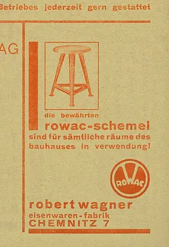
Bauhaus
Circle, square and triangle in primary colours, sans serif lettering and no ornament. The safest bet.
Style: Bauhaus, basic geometric shapes and primary coloursImagen: Herbert Bayer · CC BY-SA 3.0, Wikimedia Commons - 006
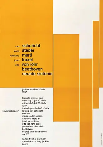
Swiss Style
Strict grid, grotesque type and lots of white space. For when the text is what matters.
Style: Swiss / International Typographic Style, strict grid and grotesque typeImagen: Josef Müller-Brockmann · dominio público, Wikimedia Commons - 007
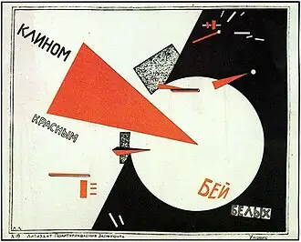
Constructivism
Diagonals, red and black, huge letters and photomontage. Pure energy, one of the furthest from generic.
Style: Russian constructivism, diagonals, red and black, photomontageImagen: El Lissitzky · dominio público, Wikimedia Commons - 008
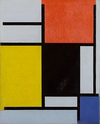
De Stijl
Mondrian's grid: thick black lines and blocks of red, yellow and blue.
Style: De Stijl, black grid with red, yellow and blue blocksImagen: Piet Mondrian · dominio público, Wikimedia Commons - 009
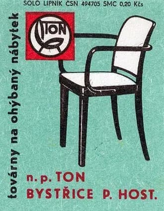
Mid-century modern
Flat 1950s illustration, boomerang shapes and muted warm colours. Friendly.
Style: mid-century modern, flat 1950s illustrationImagen: Anonymous matchbox label · dominio público, Wikimedia Commons - 010
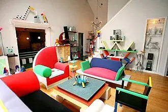
Memphis
Squiggles, zigzags and geometric shapes in clashing colours. Loud and fun.
Style: 1980s Memphis, zigzags and colourful geometric shapesImagen: Dennis Zanone · CC BY-SA 3.0, Wikimedia Commons - 011
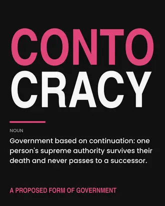
Brutalist graphic design
Black blocks and heavy type, ugly on purpose. For alternative events.
Style: brutalist graphic design, black blocks and heavy typeImagen: Contocrat Fan · CC BY 4.0, Wikimedia Commons - 012
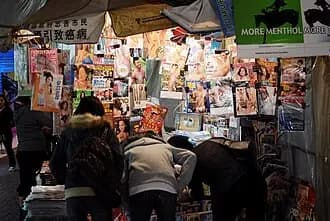
Contemporary editorial
Like a magazine today: a huge headline and serif mixed with sans serif. Elegant without being cold.
Style: contemporary editorial, huge headline, serif with sans serifImagen: David Yan · CC BY 2.0, Wikimedia Commons - 013
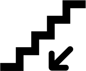
Wayfinding
Pictograms, arrows and colour codes, like the underground. Ideal when the poster explains how to get there.
Style: metro wayfinding signage, pictograms, arrows and colour codingImagen: AIGA / US DOT · dominio público, Wikimedia Commons - 014
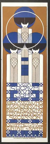
Vienna Secession
Klimt's Vienna: geometric ornament, gold and straight frames. More restrained than Art Nouveau.
Style: Vienna Secession, geometric ornament and gold in the style of KlimtImagen: Koloman Moser · dominio público, Wikimedia Commons - 015
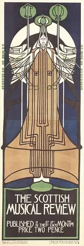
Glasgow Style
Very long verticals, stylised roses and Mackintosh's tall, narrow lettering. It brings its own lettering.
Style: Mackintosh's Glasgow Style, elongated verticals and stylised rosesImagen: Charles Rennie Mackintosh · dominio público, Wikimedia Commons - 016
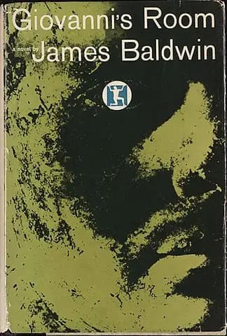
Push Pin Studios
Milton Glaser's New York: flat silhouettes and swirls of colour with a sense of humour.
Style: Push Pin Studios, black profile silhouette, flat colour without gradientsImagen: Seymour Chwast, Push Pin Studios · dominio público, Wikimedia Commons - 017
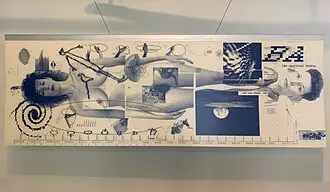
New Wave typography
Swiss style broken on purpose: overlapping layers and scattered letters.
Style: 1980s New Wave typography, overlapping layersImagen: MadeInSpace.la · CC BY-SA 4.0, Wikimedia Commons - 018
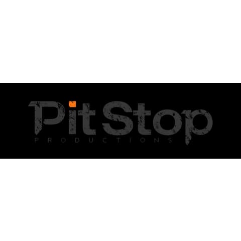
Grunge typography
Dirty, overlapping, broken 1990s letters. It brings its own texture.
Style: 1990s grunge typographyImagen: CHPitStop · dominio público, Wikimedia Commons
Art movements. They decide the image: how shapes and colour are drawn. You are asking for the poster that movement would have made.
- 019
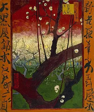
Japonisme
19th-century Europe borrowing from Japanese prints: asymmetry, flat colour and cropped framing.
Style: Japonisme, asymmetric composition and flat colourImagen: Vincent van Gogh · dominio público, Wikimedia Commons - 020
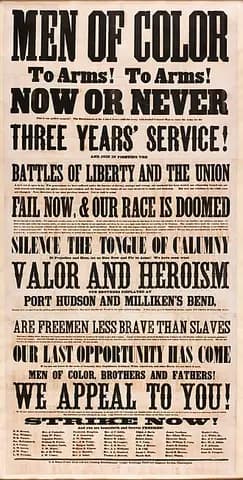
Victorian broadside
Text only, in lots of different wood types, stacked and centred. Circus and old fairground.
Style: Victorian broadside, assorted centred wood typesImagen: Anonymous, 1863 · dominio público, Wikimedia Commons - 021
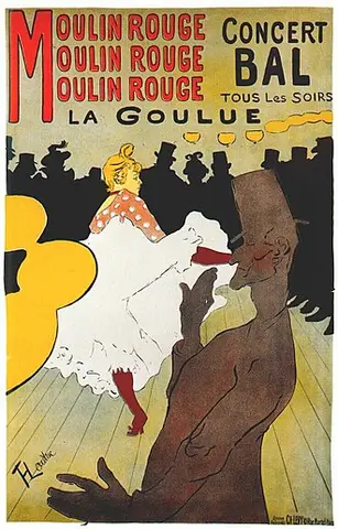
Belle Époque lithograph
Toulouse-Lautrec and Chéret: figures in motion, flat colour and cabaret.
Style: Belle Époque lithograph in the style of Toulouse-LautrecImagen: Henri de Toulouse-Lautrec · dominio público, Wikimedia Commons - 022
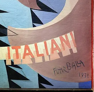
Futurism
Speed and machines, told through repeated, fragmented shapes.
Style: Italian futurism, repeated shapes suggesting speedImagen: Giacomo Balla · dominio público, Wikimedia Commons - 023
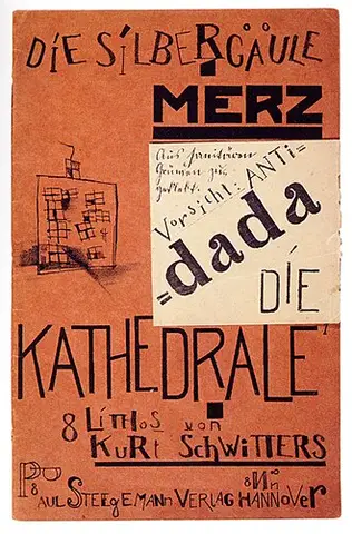
Dada collage
Newspaper cuttings, photos and chaotic letters. It brings its own paper texture.
Style: Dada collage, newspaper cuttings and ransom-note lettersImagen: Kurt Schwitters · dominio público, Wikimedia Commons - 024
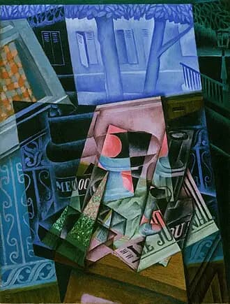
Cubism
Broken planes and several views at once, like Picasso and Braque. Perfect for exhibitions.
Style: cubist poster, fragmented planes in the style of Picasso and BraqueImagen: Juan Gris · dominio público, Wikimedia Commons - 025
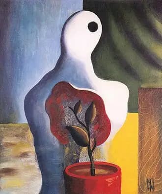
Surrealism
Dream scenes with impossible objects, like Magritte or Dalí. On its own it comes out with a glossy render look: ask for oil.
Style: 1930s surrealist oil paintingImagen: Ismael Nery · dominio público, Wikimedia Commons - 026
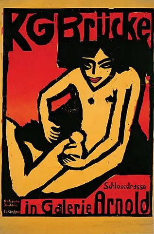
Expressionist woodcut
Rough woodcut, hard black and white and a lot of emotion. It brings its own texture.
Style: black and white expressionist woodcutImagen: Ernst Ludwig Kirchner · dominio público, Wikimedia Commons - 027
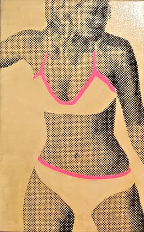
Pop art
Halftone dots, black outlines and saturated comic colours. Visible from across the street.
Style: Lichtenstein-style pop art, halftone dots and black outlinesImagen: Gerald Laing; photo Pedro Ribeiro Simões · CC BY 2.0, Wikimedia Commons - 028
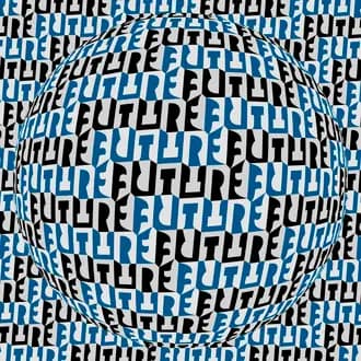
Op art
Black and white optical illusion: stripes and checkerboards that seem to move.
Style: op art, black and white optical illusionImagen: Basile Morin · CC BY-SA 4.0, Wikimedia Commons - 029
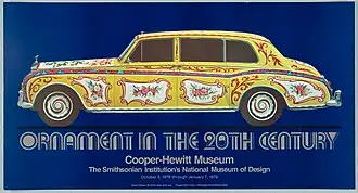
Sixties psychedelia
Melting letters and vibrating complementary colours, like the San Francisco gig posters. It brings its own lettering.
Style: 1960s psychedelic posterImagen: Cooper-Hewitt Museum · dominio público, Wikimedia Commons - 030
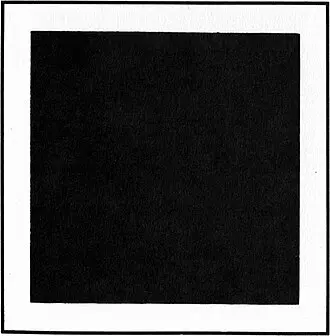
Minimalism
Very few elements and pure shapes. Silence takes the lead.
Style: minimalism, pure shapes and lots of empty spaceImagen: Kazimir Malevich · dominio público, Wikimedia Commons - 031
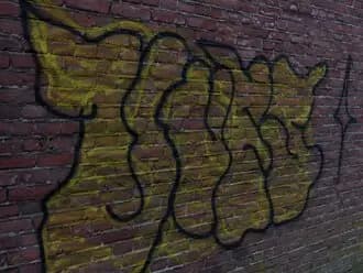
Graffiti
Spray paint, stencils and stickers on a wall. It brings its own texture.
Style: graffiti and street art, spray paint and stencilImagen: Fons Heijnsbroek · CC0, Wikimedia Commons - 032
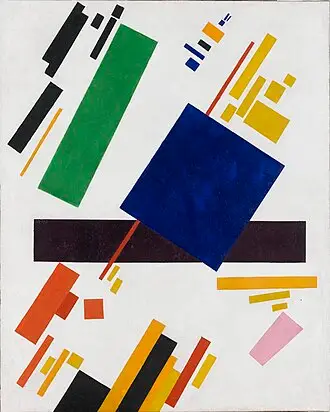
Suprematism
Pure geometric shapes floating on white, like Malevich. Lighter than constructivism.
Style: suprematism, geometric shapes floating on a white backgroundImagen: Kazimir Malevich · dominio público, Wikimedia Commons - 033
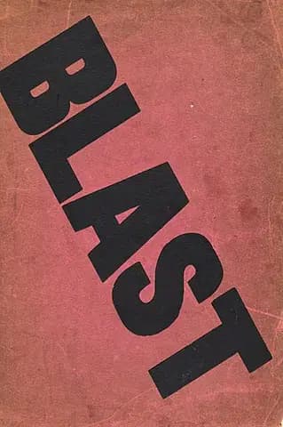
Vorticism
Aggressive angles that seem to explode from a centre. British, from 1914.
Style: vorticism, angles radiating from a centreImagen: Wyndham Lewis · dominio público, Wikimedia Commons - 034
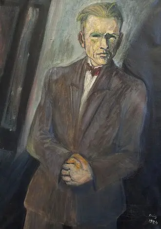
New Objectivity
1920s German realism: cold, sharp and slightly unsettling.
Style: New Objectivity (Neue Sachlichkeit), cold, sharp realismImagen: Waldemar Flaig · dominio público, Wikimedia Commons - 035
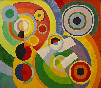
Orphism
Concentric colour discs, like the Delaunays. Colourful and rhythmic.
Style: Orphism, concentric colour discs in the style of DelaunayImagen: Robert Delaunay · dominio público, Wikimedia Commons - 036
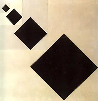
Concrete art
Mathematical abstraction: grids, progressions and exact proportions.
Style: concrete art, geometry with exact proportionsImagen: Theo van Doesburg · dominio público, Wikimedia Commons - 037
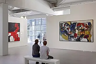
CoBrA
Spontaneous, almost childlike painting with strong colours and distorted figures.
Style: CoBrA, spontaneous painting in intense coloursImagen: Cobra Museum · CC BY-SA 4.0, Wikimedia Commons - 038
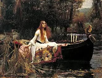
Pre-Raphaelite
Painstaking detail, idealised figures and a medieval air. Romantic.
Style: Pre-Raphaelite illustrationImagen: John William Waterhouse · dominio público, Wikimedia Commons - 039
Big eyes (Keane)
Figures with huge sad eyes, 1960s kitsch. Risky.
Style: Keane big eyes, 1960s kitsch
Printing techniques. They decide the finish: the grain, the inks and the paper. Almost all of them bring their own texture.
- 040
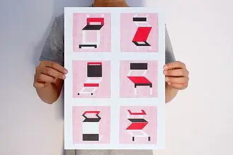
Risograph
Two or three flat inks, slightly misaligned and grainy. Very modern zine.
Style: two-colour risographImagen: Mario Felipe · CC BY 2.0, Wikimedia Commons - 041
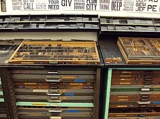
Letterpress
Ink pressed into thick paper, with small imperfections. Crafted and weighty.
Style: modern letterpress on thick paperImagen: Michellecornelison · CC BY-SA 4.0, Wikimedia Commons - 042
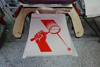
Pop screenprint
Overlapping flat inks, slightly off register. The limited-edition gig poster.
Style: gig poster screenprint, overlapping flat inksImagen: Manolis Angelakis · CC BY 4.0, Wikimedia Commons - 043
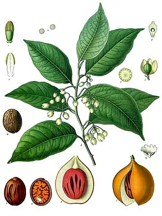
Botanical illustration
Fine-line plants with labels and a single accent colour. Delicate.
Style: scientific botanical illustration with one accent colourImagen: Franz Eugen Köhler · dominio público, Wikimedia Commons - 044
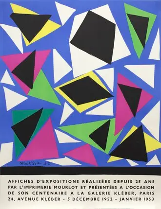
Cut paper (Matisse)
Organic shapes in coloured paper, with no outlines. Cheerful and clean.
Style: Matisse-style cut paperImagen: Henri Matisse · dominio público, Wikimedia Commons - 045
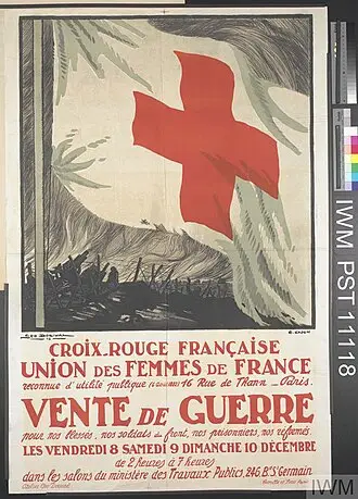
Monochrome plus one accent
Everything in black and white except one colour. The type leads.
Style: monochrome with a single accent colourImagen: Georges Capon & Georges Dorival · dominio público, Wikimedia Commons - 046
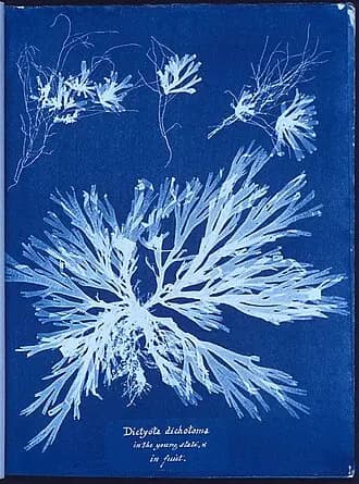
Cyanotype
Prussian blue and white, somewhere between an old photo and a blueprint.
Style: cyanotype, Prussian blue and whiteImagen: Anna Atkins · dominio público, Wikimedia Commons - 047
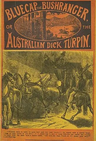
Victorian novel cover
A sensational 19th-century cover: engraving and over-the-top titles. It brings its own lettering.
Style: penny dreadful Victorian novel coverImagen: Anonymous · dominio público, Wikimedia Commons - 048
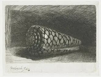
Etching
Fine lines and cross-hatching, like a banknote or an old book.
Style: cross-hatched etchingImagen: Rembrandt · dominio público, Wikimedia Commons - 049
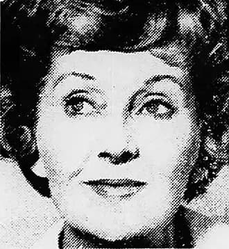
Newsprint halftone
Big halftone dots on newsprint. Retro, with a breaking-news feel.
Style: halftone on newsprintImagen: Anonymous · dominio público, Wikimedia Commons - 050
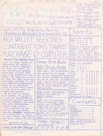
Mimeograph
The school handout in faded purple ink. Hardly anyone uses it, which is why it surprises.
Style: purple-ink mimeograph copyImagen: Dan T. · CC BY-SA 3.0, Wikimedia Commons
Handmade and folk. They imitate what a person would do by hand, not a designer. They break the seriousness.
- 051
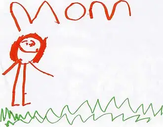
Child's painting, pro type
A small child's poster paint with type set by a designer. One of the most eye-catching.
Style: small child's poster paint with professional designer typographyImagen: Lexi, 3 · CC BY-SA 3.0, Wikimedia Commons - 052
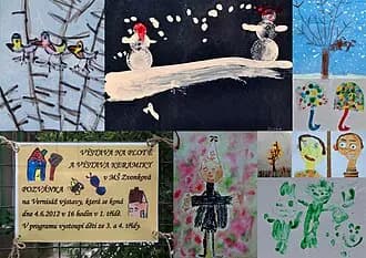
School cutout collage
Card, scissors and classroom glue. Familiar.
Style: school cutout collage in coloured cardImagen: encsere · CC BY 3.0, Wikimedia Commons - 053
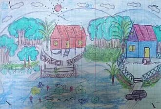
Naive crayon
Naive crayon strokes and flat colours. Very warm.
Style: naive crayon drawingImagen: Khamkhoune, 11 (Basile Morin) · CC BY-SA 4.0, Wikimedia Commons - 054
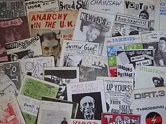
Punk fanzine
Photocopies, cuttings and ransom-note letters. It brings its own texture.
Style: photocopied punk fanzineImagen: Jake from Manchester · CC BY 2.0, Wikimedia Commons - 055
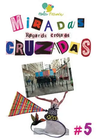
Cut-and-paste zine
Put together by hand with tape and cuttings, tidier than punk.
Style: cut-and-paste zine with sticky tapeImagen: Amigosdelfrancés · CC BY-SA 4.0, Wikimedia Commons - 056
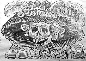
Posada skulls
The skulls of Mexican engraver José Guadalupe Posada. A party with dark humour.
Style: calaveras in the style of José Guadalupe PosadaImagen: Guadalupe Posada · dominio público, Wikimedia Commons - 057
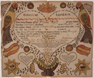
Pennsylvania Fraktur
Folk calligraphy with tulips, hearts and birds.
Style: Pennsylvania Dutch Fraktur, tulips and birdsImagen: Friedrich Krebs · dominio público, Wikimedia Commons - 058
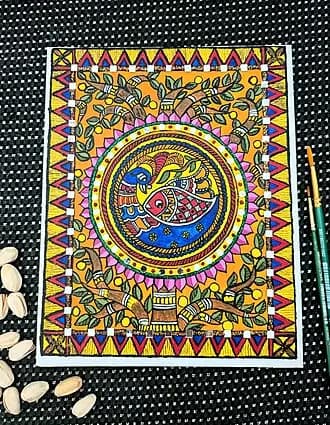
Madhubani
Indian folk art: double lines and patterns that fill every space.
Style: Indian Madhubani folk artImagen: Bhuvana Meenakshi · CC BY-SA 3.0, Wikimedia Commons - 059
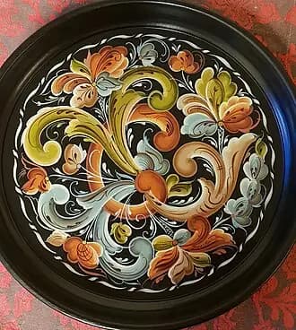
Rosemaling
Norwegian floral painting with scrolls and warm colours.
Style: Scandinavian rosemalingImagen: Rune Nesher · CC BY-SA 4.0, Wikimedia Commons
Countries and eras. Each one brings the way its country and its moment composed and drew.
- 060
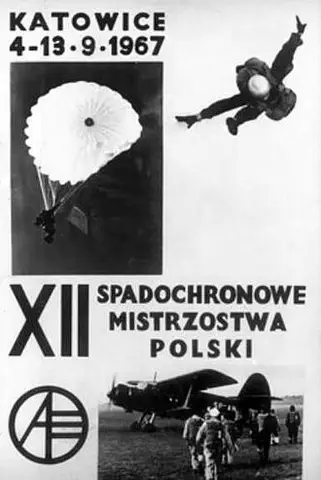
Polish Poster School
A painted image that means something else. Brilliant for film, theatre and books.
Style: Polish Poster School, painted metaphorical imageImagen: Aeroklub Polskiej Rzeczypospolitej Ludowej · dominio público, Wikimedia Commons - 061
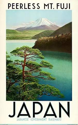
Golden age travel poster
Flat lithograph landscapes from the 1920s to the 1950s. Evocative and safe.
Style: 1930s golden age travel posterImagen: Japanese Government Railways · dominio público, Wikimedia Commons - 062
Japanese minimalism
Almost all empty space and a single element. The quietest one.
Style: Japanese minimal poster, a single element and lots of empty spaceImagen: Hasegawa Tōhaku · dominio público, Wikimedia Commons - 063
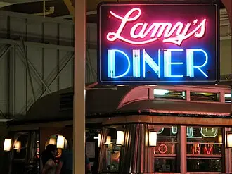
Diner neon
Neon signs from an American roadside diner. Nocturnal and nostalgic.
Style: American diner neon signImagen: PunkToad · CC BY 2.0, Wikimedia Commons - 064
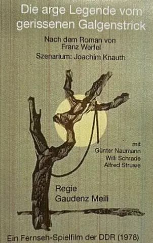
East German film
East German film posters: graphic and very experimental.
Style: East German DEFA film posterImagen: Fernsehen der DDR · CC BY-SA 3.0, Wikimedia Commons - 065
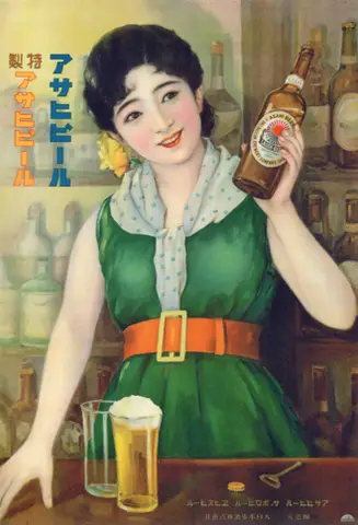
Taishō modern
1920s Japan: tradition mixed with Art Deco.
Style: Taishō modern, 1920s JapanImagen: Teiji Tsutsumi (attr.) · dominio público, Wikimedia Commons - 066
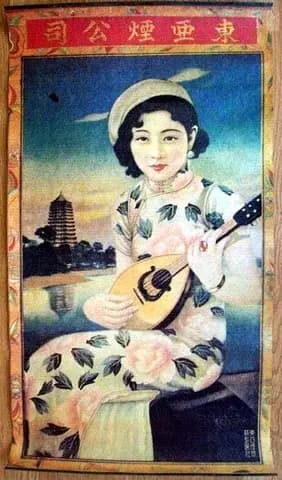
Shanghai calendar poster
1920s and 30s calendar posters, with female figures and soft colours.
Style: Shanghai calendar poster (yuefenpai)Imagen: East Asian Cigarette Co. · dominio público, Wikimedia Commons - 067
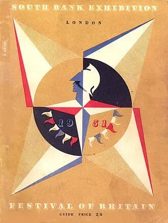
Festival of Britain
British modernism from 1951: light, colourful and optimistic.
Style: 1951 Festival of BritainImagen: Festival of Britain, 1951 · dominio público, Wikimedia Commons - 068
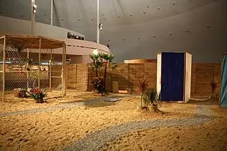
Tropicália
1960s Brazil: strong colour, psychedelia and popular culture.
Style: Brazilian TropicáliaImagen: Hélio Oiticica; photo Ministério da Cultura · CC BY 2.0, Wikimedia Commons - 069
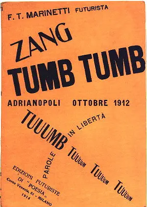
Italian futurist typography
Words in freedom: diagonal text in mixed sizes that becomes the image.
Style: Italian futurist typography, words in freedomImagen: Talmoryair · CC BY-SA 3.0, Wikimedia Commons - 070
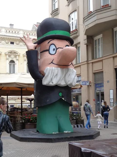
Zagreb School
1950s Yugoslav animation: flat, stylised shapes with humour.
Style: Zagreb School animationImagen: Professor Baltazar, Zagreb Film; photo Silverije · CC BY-SA 4.0, Wikimedia Commons - 071
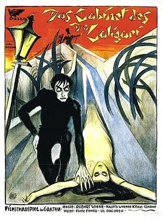
German expressionist film
Angular shadows and impossible perspectives, like Caligari. Dark and dramatic.
Style: German expressionist film poster in the style of CaligariImagen: Rudolf Ledl / Fritz Bernhard · dominio público, Wikimedia Commons - 072
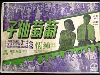
Hong Kong cinema
Action collage with overlapping characters and Chinese lettering. Intense.
Style: Hong Kong action film posterImagen: Anonymous · dominio público, Wikimedia Commons - 073
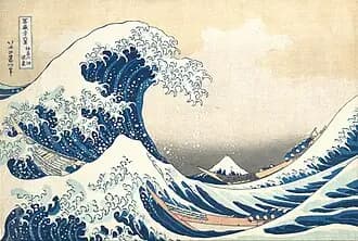
Ukiyo-e
Hokusai and Hiroshige: waves, mountains, outlines and flat colour. It brings its own lettering.
Style: ukiyo-e, Japanese woodblock print in the style of HokusaiImagen: Katsushika Hokusai · dominio público, Wikimedia Commons
Politics and activism. Very powerful aesthetics, but they carry their political baggage. Use them wisely.
- 074
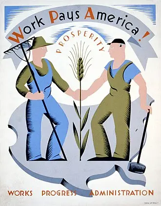
WPA / New Deal
1930s American public screenprints: simple shapes, flat colours and a civic message.
Style: WPA New Deal posterImagen: Vera Bock, WPA · dominio público, Wikimedia Commons - 075
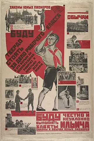
Soviet propaganda
Red, diagonals and heroic figures gazing at the horizon.
Style: Soviet propaganda posterImagen: Anonymous · CC BY-SA 4.0, Wikimedia Commons - 076
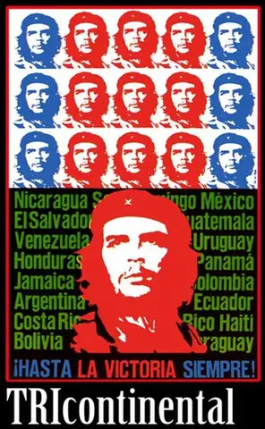
Cuban poster (OSPAAAL)
Very vivid flat colours and bold silhouettes.
Style: Cuban OSPAAAL revolutionary posterImagen: OSPAAAL · dominio público, Wikimedia Commons - 077
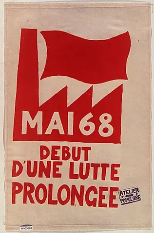
May 68
Single-ink screenprint, direct drawing and a short message.
Style: Paris May 1968 Atelier Populaire screenprintImagen: Atelier Populaire · CC0, Wikimedia Commons - 078
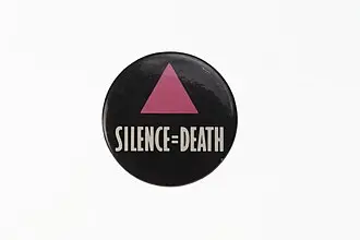
ACT UP
White type on black, blunt and unadorned.
Style: ACT UP activist posterImagen: Silence = Death Project · dominio público, Wikimedia Commons - 079
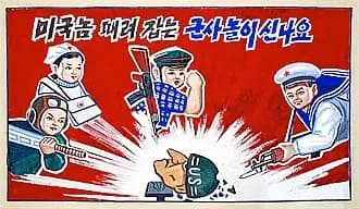
North Korean propaganda
Super-saturated colours and heroic realism.
Style: North Korean propaganda posterImagen: stephan · CC BY-SA 2.0, Wikimedia Commons - 080
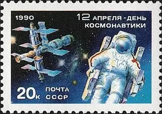
Soviet space programme
Cosmonauts, rockets and optimistic retrofuturism.
Style: Soviet space programme posterImagen: USSR Post, 1990 · dominio público, Wikimedia Commons
Music and subcultures. The look of a specific scene. For gigs, parties and a young crowd.
- 081
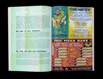
90s rave
Neon, warped letters and smiley faces. Dance-floor energy.
Style: 1990s acid rave flyerImagen: Rave Scout Cookies · CC BY-SA 4.0, Wikimedia Commons - 082
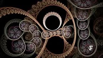
Drum and bass
Primitive 3D and computer fractals from the era.
Style: 1990s drum and bass flyerImagen: Alexnardini · CC BY-SA 4.0, Wikimedia Commons - 083
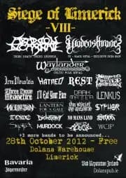
Indie festival
A big graphic on top and the bands stacked from most to least important.
Style: indie festival lineup posterImagen: Badreplive · CC BY-SA 3.0, Wikimedia Commons - 084
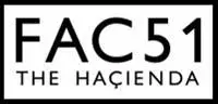
Factory Records
Industrial minimalism, Peter Saville style. Almost nothing, very designed.
Style: Factory Records in the style of Peter SavilleImagen: The Haçienda (FAC 51) · dominio público, Wikimedia Commons - 085
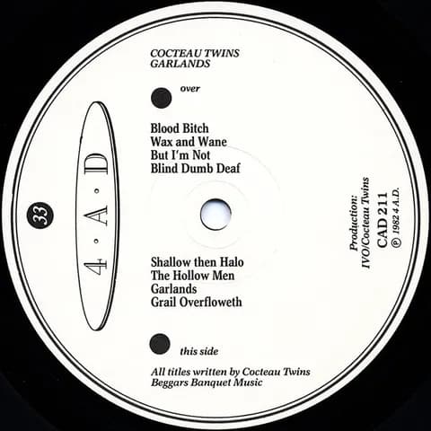
4AD
Ethereal textures and blurred photography, like Vaughan Oliver's covers.
Style: 4AD record cover in the style of Vaughan OliverImagen: Cocteau Twins, Garlands (4AD) · dominio público, Wikimedia Commons - 086
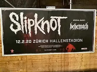
Heavy metal
Spiky logo and very detailed dark illustration.
Style: heavy metal concert posterImagen: Ank Kumar · CC BY-SA 4.0, Wikimedia Commons - 087
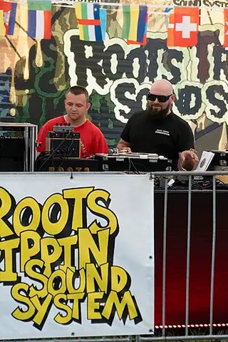
Reggae sound system
Red, yellow and green with hand-painted lettering.
Style: reggae sound system flyerImagen: Krzysztof Popławski · CC BY-SA 4.0, Wikimedia Commons - 088
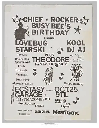
New York hip hop
Photocopy and street lettering, 1980s block party.
Style: 1980s NYC hip hop flyerImagen: Anonymous · CC0, Wikimedia Commons - 089
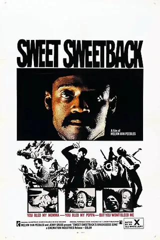
Blaxploitation
1970s character collage, loud lettering and a lot of attitude.
Style: blaxploitation movie posterImagen: Cinemation Industries · dominio público, Wikimedia Commons - 090
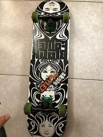
Skate graphics
Aggressive skateboard-deck illustration and strong colours.
Style: skateboard deck graphicsImagen: Leonardo Alcahuamán · CC0, Wikimedia Commons
Digital and contemporary. Born on screen. Used well they feel very current; used badly, they are exactly the generic poster.
- 091
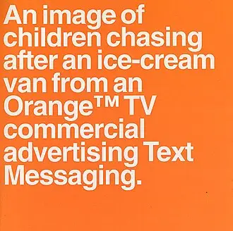
The Designers Republic
Satirical corporate logos and 1990s cyberculture.
Style: The Designers RepublicImagen: The Designers Republic · dominio público, Wikimedia Commons - 092
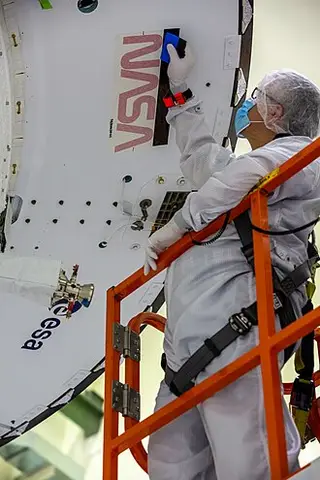
NASA worm
NASA's 1970s identity manual: clean, technical and red.
Style: 1970s NASA worm identity manualImagen: NASA / Cory Huston · dominio público, Wikimedia Commons - 093
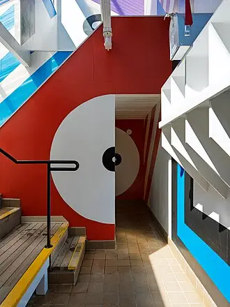
Corporate psychedelia
1970s curves and colour, but tidied up for a company.
Style: 1970s corporate psychedeliaImagen: Dale Cruse · CC BY 4.0, Wikimedia Commons - 094
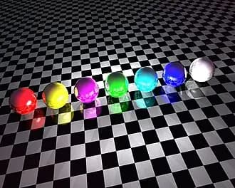
Y2K chrome
Chrome, bubbles and the year 2000.
Style: Y2K chromeImagen: cabo · CC BY-SA 3.0, Wikimedia Commons - 095
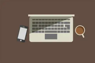
Flat illustration
The one you see everywhere. Careful: it is the closest to the generic poster.
Style: contemporary flat illustrationImagen: Zombkid · CC BY-SA 4.0, Wikimedia Commons - 096
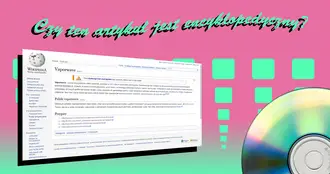
Vaporwave
Pink and cyan, classical statues and 1990s digital nostalgia.
Style: vaporwaveImagen: Kazachstanski nygus · dominio público, Wikimedia Commons - 097
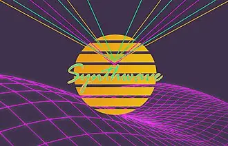
Synthwave
Neon grid, 1980s sun and an endless road.
Style: synthwaveImagen: Nocturnal.Gray.Fox · CC0, Wikimedia Commons - 098
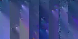
Glitch
Digital errors and shifted RGB colours.
Style: glitch artImagen: PantheraLeo1359531 · dominio público, Wikimedia Commons - 099
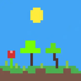
Pixel art
Visible pixels and few colours, like an old video game.
Style: 16-bit pixel artImagen: Fahmirayan · CC BY-SA 4.0, Wikimedia Commons - 100
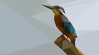
Low poly
Faceted polygons, like a low-resolution 3D model.
Style: low polyImagen: Elionas · CC0, Wikimedia Commons
Want more? Ask ChatGPT for them: "Give me a list of poster styles to choose from".
ChatGPT is not the problem
Lots of people say you can "tell" AI images. What you can tell is that nobody gave it instructions.
A designer without a brief would also make you the parade poster with little gold stars. Ask ChatGPT exactly what you would ask a designer: format, goal, style, copy, typeface, colours and what you don't want. And it gives you back what a designer would.
It is a designer inside a chat. The problem is that we talk to it like a search engine.
In short
- If you don't specify, ChatGPT goes for the average.
- Ask it what its ornaments are called and ban them.
- 7-line prompt: format, what it is, theme, style, exact text, typeface and palette, avoid.
- "No other text" and the Avoid line, always.
- Style changes everything, and you can mix three.
- If the style brings its own lettering or texture, don't take it away.
- For carousels, turn it into a skill.
Try it with the next poster you have to make. And send it to that friend who still makes posters with little gold stars.