12 web design styles applied to the same page
Brutalism, minimalism, glassmorphism, liquid glass, bento grid and seven more, on the same landing page. Switch styles, tweak each one and copy the prompt that builds it that way.
1. Brutalism
It comes from the raw concrete architecture of the 1950s and reached the web as a reaction to polished templates: black borders, hard shadows with no blur, uppercase and flat colors that don't ask permission. The version Gumroad or Figma use is called neo-brutalism, and this is it.
It works when you want to be remembered and your audience can take some noise: creator tools, portfolios, launches. The control stretches the hard shadow, from 4 to 20 pixels.
2. Minimalism
Remove things until there is nothing left to remove. No fills or shadows, a light serif, a one-pixel line to separate, black and white photos and twice the air you think is normal.
It is the hardest to get right, because there is no ornament to hide bad spacing. The control warms the white toward the color of paper.
3. Neo-futurism
Science fiction turned into an interface: a near-black background, a single neon, chamfered corners, an uppercase telemetry monospace and a background grid.
It suits technical products: AI, crypto, infrastructure, games. The control turns the hue of the neon.
4. Glassmorphism
Frosted glass panels over blobs of color. It took off in 2020 with macOS Big Sur, and it has a rule almost everyone breaks: without color behind it, the glass is invisible.
The control changes the blur, from 4 to 40 pixels. Take it all the way down and you'll see why glass with little blur can't be read.
5. Maximalism
More is more. A huge italic serif, every card a different color, stripes and dots in the background, double shadows and nothing quite straight. It is the answer to ten years of identical white websites.
The catch: the apply button still has to be found in one second. The control turns the whole palette at once, photos included.
6. Claymorphism
Modeling clay. Pastels, everything very round and a volume that comes from three shadows at once: one outside that lifts it and two inside that inflate it.
It fits friendly products: apps for kids, banks for people who aren't into finance, onboardings. The control turns the volume up and down.
7. Liquid Glass
The material Apple shipped in 2025 with iOS 26: almost transparent glass that **refracts** what is behind it, a highlight on the edge and everything in capsules. Behind it there is a fixed photo so the glass has something to bend.
Only Chrome paints the real refraction, with an SVG filter; Safari and Firefox keep the blur. The control changes how much the background bends.
8. Bento Grid
Boxes of different sizes that fit with no gaps, like a Japanese lunch box. Apple keynotes made it popular and today it is on half the SaaS landing pages out there.
Here every section of the page becomes a rounded grey box, and what is inside, smaller white boxes. The control changes the gap between boxes.
9. Spatial UI
visionOS: glass windows floating in front of your living room, with long shadows that lift them off the background. It was made for a headset, but it is sneaking onto the web.
The control turns the side cards toward the center, as if they wrapped around your field of view, and lengthens their shadow.
The next three were not on the list, but the other nine don't make sense without them.
10. Neumorphism
Everything the same color as the background and molded from it: a light shadow top-left and a dark one bottom-right. It was the Dribbble craze of 2020 and the grandparent of claymorphism.
It looks beautiful and works terribly, because a button you can only tell apart by its relief can't be told apart. The control raises the relief.
11. Skeuomorphism
Copying the real world: linen in the background, brushed aluminium bars, bevelled paper, stitched leather and blue gel buttons. The calculator figure shows up on a little LCD screen. It was the iPhone before 2013, and Liquid Glass is, deep down, its comeback.
The control raises the gloss of the gel.
12. Swiss design
The International Typographic Style of the 1950s: a strict grid, a bold grotesque set flush left, black rules and one red. Almost all serious web design descends from it.
The control shows the twelve columns, so you can see that everything starts and ends on one.
Which one to pick
None is better than another. Minimalism and Swiss sell what is expensive; brutalism and maximalism, what wants to be remembered; glass and spatial, what wants to look like tomorrow.
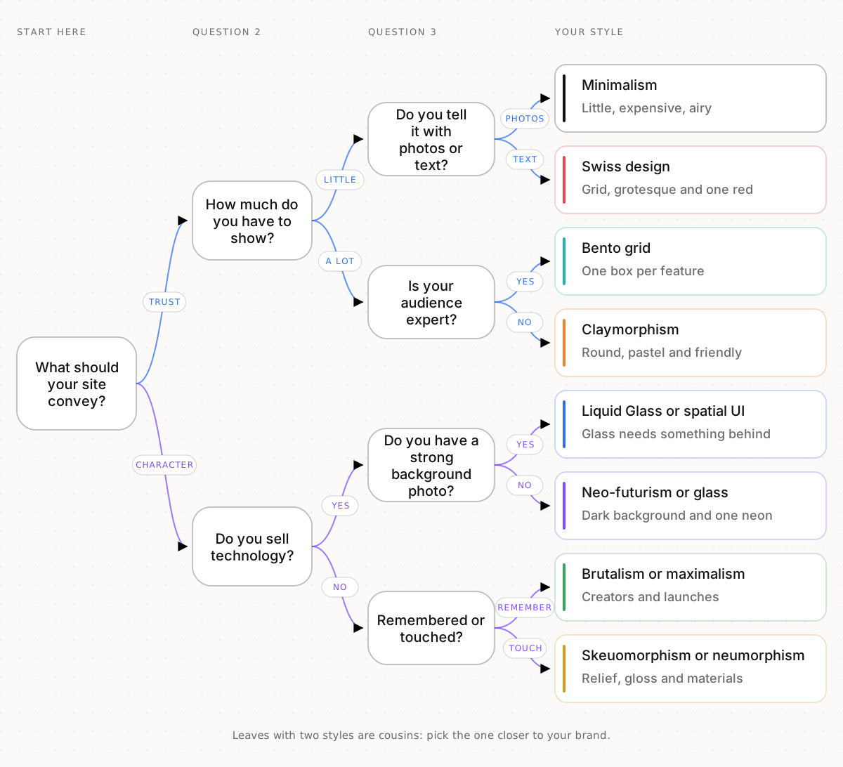
Pick one, copy its prompt and have your agent apply all of it. Mixing three at once is exactly what makes a website look AI-made.